Titan - Skeleton Loading for B2B SaaS
Client:
AffinityX
Duration:
2 Weeks

Stop the spinner. Keep the work moving. How I replaced Titan's full-page loaders with skeleton states, so operations teams kept working while their data loaded instead of waiting on a frozen screen.
Role Senior UI/UX Designer, 1 of 2 designers
Team Product manager, stakeholders and developers
Timeline 2 weeks, wireframe to release
Scope Loading audit, research, wireframes, UI, handoff
Tools Figma, MUI v6 design system
01 — The problem

One table refresh froze the entire product.
Titan's operations teams live inside tables of orders, items and production jobs. Every filter, sort and refresh reloads one of those tables, and every time it did, a full-page loader covered everything. Navigation, filters, export: all locked until the last row arrived.
Users weren't waiting on one table. They were locked out of the whole product.
Blocked work. No checking another record or preparing the next step while one table loaded.
No sense of progress. A spinner over everything hides what is loading and how long it will take.
Lost context. The page vanished and reappeared, so users had to find their place again.
02 — The insight

It wasn't a bug. It was a pattern.
The PM flagged one slow table. Instead of patching that screen, I audited every loading moment across Titan's tables, dashboards and data panels. The same full-page loader showed up everywhere.
That reframed the brief: not “fix this table”, but “define how Titan loads, everywhere.” To ground the decision, I studied how Jira handles loading in its data-heavy views and compared the patterns side by side.
03 — The decision

Three options. One kept people working.
Inline spinners. The rest of the page stays usable, but the layout still jumps when data lands, and users get no hint of what is coming.
Progress bars. Great for long tasks of known length. Table loads have no reliable length to show.
Skeleton loaders chosen Only the loading area changes. The layout holds still, and users see the shape of the data before it arrives.
The cost of skeletons is effort: every table, card and widget needs its own placeholder. I turned that into a one-time cost by building them as reusable components in our MUI v6 design system.
04 — The solution
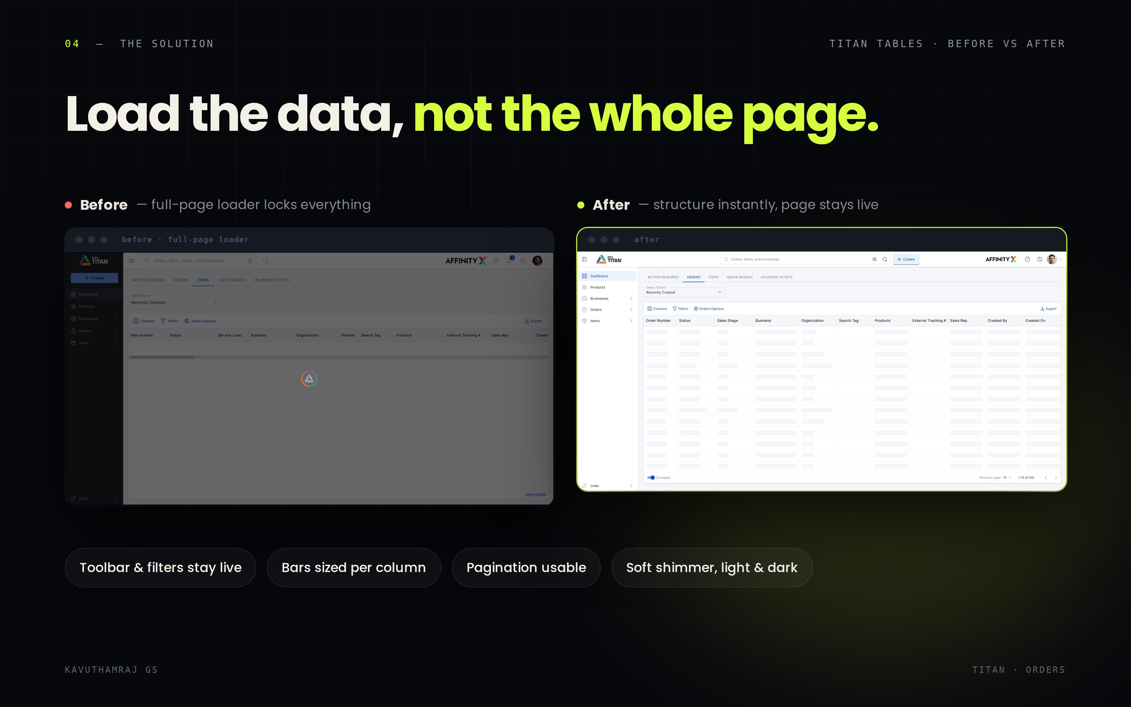
Load the data, not the whole page.
Before, a full-page loader covered everything until every row arrived. After, the table structure appears instantly and the toolbar, filters and pagination stay usable.

Load only what changes. The skeleton covers just the table being refreshed. Navigation, filters and pagination stay live.
Mirror the real data. Each placeholder sits under its real column, sized to what that column holds: short for Status, long for Business.
Show it instantly. Skeletons appear at once and real rows replace them as they arrive.
Keep motion calm. A soft shimmer says “working” without stealing attention.
Build once, use everywhere. Table, card and widget skeletons live in the design system, in light and dark mode.
I also designed the edges: an empty state for filters that return nothing, and an error state with a retry when a load fails.
05 — How it shipped

From wireframe to release in 2 weeks.
Wireframe. A grayscale skeleton of the Orders table, placed next to the old blocked screen.
Align. Walked the PM, stakeholders and developers through the before and after. The side-by-side made the case on its own, and the direction was approved fast.
Design. High-fidelity skeleton components and states in Figma, inside the design system.
Hand off. Component specs, behaviour rules and every state, so developers could roll it out screen by screen.
06 — Impact

The wait didn't vanish. It stopped blocking anyone.
~40% faster-feeling waits, as estimated by the PM after release
3 states designed for every load: loading, empty and error
2 weeks from first wireframe to release
Users kept working while their data loaded and finished tasks faster. The fix didn't stay on one screen either: skeletons became a standard part of Titan's design system, so new tables and panels can reuse them instead of starting from scratch.
“Users stopped complaining that the app was stuck.” Product Manager, Titan
07 — What I learned

Small details decide how fast people work.
Treat a bug as a possible pattern. One complaint about one table became a product-wide standard.
Show, don't argue. A side-by-side wireframe won agreement faster than any written proposal could.
Measure before you change. Next time I'd capture task times first, so the impact has a hard baseline, not just an estimate.
In a tool people use all day, the moments between screens matter as much as the screens themselves.
Stop the spinner. Keep the work moving. How I replaced Titan's full-page loaders with skeleton states, so operations teams kept working while their data loaded instead of waiting on a frozen screen.
Role Senior UI/UX Designer, 1 of 2 designers
Team Product manager, stakeholders and developers
Timeline 2 weeks, wireframe to release
Scope Loading audit, research, wireframes, UI, handoff
Tools Figma, MUI v6 design system
01 — The problem
One table refresh froze the entire product.
Titan's operations teams live inside tables of orders, items and production jobs. Every filter, sort and refresh reloads one of those tables, and every time it did, a full-page loader covered everything. Navigation, filters, export: all locked until the last row arrived.
Users weren't waiting on one table. They were locked out of the whole product.
Blocked work. No checking another record or preparing the next step while one table loaded.
No sense of progress. A spinner over everything hides what is loading and how long it will take.
Lost context. The page vanished and reappeared, so users had to find their place again.
02 — The insight
It wasn't a bug. It was a pattern.
The PM flagged one slow table. Instead of patching that screen, I audited every loading moment across Titan's tables, dashboards and data panels. The same full-page loader showed up everywhere.
That reframed the brief: not “fix this table”, but “define how Titan loads, everywhere.” To ground the decision, I studied how Jira handles loading in its data-heavy views and compared the patterns side by side.
03 — The decision
Three options. One kept people working.
Inline spinners. The rest of the page stays usable, but the layout still jumps when data lands, and users get no hint of what is coming.
Progress bars. Great for long tasks of known length. Table loads have no reliable length to show.
Skeleton loaders chosen Only the loading area changes. The layout holds still, and users see the shape of the data before it arrives.
The cost of skeletons is effort: every table, card and widget needs its own placeholder. I turned that into a one-time cost by building them as reusable components in our MUI v6 design system.
04 — The solution
Load the data, not the whole page.
Before, a full-page loader covered everything until every row arrived. After, the table structure appears instantly and the toolbar, filters and pagination stay usable.
Load only what changes. The skeleton covers just the table being refreshed. Navigation, filters and pagination stay live.
Mirror the real data. Each placeholder sits under its real column, sized to what that column holds: short for Status, long for Business.
Show it instantly. Skeletons appear at once and real rows replace them as they arrive.
Keep motion calm. A soft shimmer says “working” without stealing attention.
Build once, use everywhere. Table, card and widget skeletons live in the design system, in light and dark mode.
I also designed the edges: an empty state for filters that return nothing, and an error state with a retry when a load fails.
05 — How it shipped
From wireframe to release in 2 weeks.
Wireframe. A grayscale skeleton of the Orders table, placed next to the old blocked screen.
Align. Walked the PM, stakeholders and developers through the before and after. The side-by-side made the case on its own, and the direction was approved fast.
Design. High-fidelity skeleton components and states in Figma, inside the design system.
Hand off. Component specs, behaviour rules and every state, so developers could roll it out screen by screen.
06 — Impact
The wait didn't vanish. It stopped blocking anyone.
~40% faster-feeling waits, as estimated by the PM after release
3 states designed for every load: loading, empty and error
2 weeks from first wireframe to release
Users kept working while their data loaded and finished tasks faster. The fix didn't stay on one screen either: skeletons became a standard part of Titan's design system, so new tables and panels can reuse them instead of starting from scratch.
“Users stopped complaining that the app was stuck.” Product Manager, Titan
07 — What I learned
Small details decide how fast people work.
Treat a bug as a possible pattern. One complaint about one table became a product-wide standard.
Show, don't argue. A side-by-side wireframe won agreement faster than any written proposal could.
Measure before you change. Next time I'd capture task times first, so the impact has a hard baseline, not just an estimate.
In a tool people use all day, the moments between screens matter as much as the screens themselves.
Stop the spinner. Keep the work moving. How I replaced Titan's full-page loaders with skeleton states, so operations teams kept working while their data loaded instead of waiting on a frozen screen.
Role Senior UI/UX Designer, 1 of 2 designers
Team Product manager, stakeholders and developers
Timeline 2 weeks, wireframe to release
Scope Loading audit, research, wireframes, UI, handoff
Tools Figma, MUI v6 design system
01 — The problem
One table refresh froze the entire product.
Titan's operations teams live inside tables of orders, items and production jobs. Every filter, sort and refresh reloads one of those tables, and every time it did, a full-page loader covered everything. Navigation, filters, export: all locked until the last row arrived.
Users weren't waiting on one table. They were locked out of the whole product.
Blocked work. No checking another record or preparing the next step while one table loaded.
No sense of progress. A spinner over everything hides what is loading and how long it will take.
Lost context. The page vanished and reappeared, so users had to find their place again.
02 — The insight
It wasn't a bug. It was a pattern.
The PM flagged one slow table. Instead of patching that screen, I audited every loading moment across Titan's tables, dashboards and data panels. The same full-page loader showed up everywhere.
That reframed the brief: not “fix this table”, but “define how Titan loads, everywhere.” To ground the decision, I studied how Jira handles loading in its data-heavy views and compared the patterns side by side.
03 — The decision
Three options. One kept people working.
Inline spinners. The rest of the page stays usable, but the layout still jumps when data lands, and users get no hint of what is coming.
Progress bars. Great for long tasks of known length. Table loads have no reliable length to show.
Skeleton loaders chosen Only the loading area changes. The layout holds still, and users see the shape of the data before it arrives.
The cost of skeletons is effort: every table, card and widget needs its own placeholder. I turned that into a one-time cost by building them as reusable components in our MUI v6 design system.
04 — The solution
Load the data, not the whole page.
Before, a full-page loader covered everything until every row arrived. After, the table structure appears instantly and the toolbar, filters and pagination stay usable.
Load only what changes. The skeleton covers just the table being refreshed. Navigation, filters and pagination stay live.
Mirror the real data. Each placeholder sits under its real column, sized to what that column holds: short for Status, long for Business.
Show it instantly. Skeletons appear at once and real rows replace them as they arrive.
Keep motion calm. A soft shimmer says “working” without stealing attention.
Build once, use everywhere. Table, card and widget skeletons live in the design system, in light and dark mode.
I also designed the edges: an empty state for filters that return nothing, and an error state with a retry when a load fails.
05 — How it shipped
From wireframe to release in 2 weeks.
Wireframe. A grayscale skeleton of the Orders table, placed next to the old blocked screen.
Align. Walked the PM, stakeholders and developers through the before and after. The side-by-side made the case on its own, and the direction was approved fast.
Design. High-fidelity skeleton components and states in Figma, inside the design system.
Hand off. Component specs, behaviour rules and every state, so developers could roll it out screen by screen.
06 — Impact
The wait didn't vanish. It stopped blocking anyone.
~40% faster-feeling waits, as estimated by the PM after release
3 states designed for every load: loading, empty and error
2 weeks from first wireframe to release
Users kept working while their data loaded and finished tasks faster. The fix didn't stay on one screen either: skeletons became a standard part of Titan's design system, so new tables and panels can reuse them instead of starting from scratch.
“Users stopped complaining that the app was stuck.” Product Manager, Titan
07 — What I learned
Small details decide how fast people work.
Treat a bug as a possible pattern. One complaint about one table became a product-wide standard.
Show, don't argue. A side-by-side wireframe won agreement faster than any written proposal could.
Measure before you change. Next time I'd capture task times first, so the impact has a hard baseline, not just an estimate.
In a tool people use all day, the moments between screens matter as much as the screens themselves.
Other Projects


© 2026. All rights Reserved.
© 2026. All rights Reserved.